Leah Frances is the eye behind American Squares, an Instagram photography project that documents American cultural relics and iconography. Frances’ work has been featured in numerous print and online platforms including The New York Times Magazine, Us of America Magazine, Frankie magazine, the SFMOMA blog, Subjectively Objective, Feature Shoot, PHROOM and more and has been exhibited nationally and internationally. She is currently an MFA student in Photography at The Tyler School of Art and Architecture at Temple University in Philadelphia. American Squares is her first book.
American Squares
From 2013 through 2019, I explored America’s real and imagined images of itself through the lens of my camera. As a Canadian-born photographer raised on Vancouver Island, British Columbia, my early proximity to the United States along with a steady diet of mid-century American cinema instilled in me a fascination for commonly-held concepts of “Americanness.” Now living in Pennsylvania, I hold a deep interest in identity—its roots, and its perceptions within a culture and across time. Photography, as my vehicle through this exploration, allows me to focus on small, striking moments and to create images that carry a persistent, quiet optimism. I find that the way I choose to frame the content of my photographs: to leave out what I want but also to include what I want, can create a sort of displaced experience, an alternate reality both for myself, as the photographer doing the composing, and for the viewer doing the looking. The resulting image becomes a portal, allowing for a flexible experience of time.
MK: Your new book opens with an essay by Yani Kong, in which she describes going through the book as “Travel (ing) the book.” I love this depiction. Was traveling an interest of yours before photography? Is being somewhere else more creatively inspiring for you than being at home?
LF: Well, while I have traveled a good deal throughout my life, nationally and internationally, a spontaneous road trip — even driving only a few hours away — has always been a great source of visual inspiration for me. Even before I picked up a camera, I was always driving somewhere. In my teens and early twenties, I was an avid thrift store shopper and I would drive up and down Vancouver Island, Canada, scouring church basements and roadside garage sales for treasures. Now, as a practicing photographer, there is something about watching the light change from a moving vehicle combined with the thrill of a chance discovery that I find elating. These days my home IS somewhere else. I live in Pennsylvania, which is very different than British Columbia, where I grew up. Something about America is perhaps more creatively affecting than Canada for me right now. It could be because I am an immigrant here with so much to discover. I do think a lot about future projects in Canada though.
MK: You moved from Canada to New York City. And while British Columbia is represented in American Squares, there seem to be far more selections from the United States. What is it about the places you photograph which draws you to them? What is it about this country? Has the current state of politics changed the way you approach the subject matter at all?
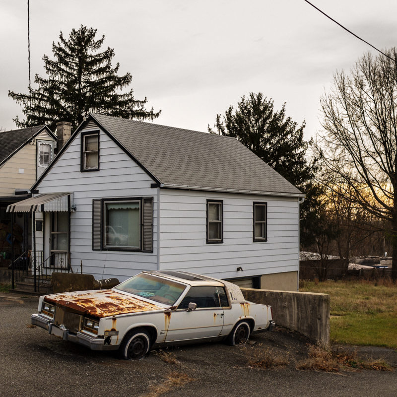
LF: The work in American Squares was attempting to investigate ideas of “Americanness,” that sticky image of America we (or at least I) carry around in my head, almost like a snapshot, that I felt was somehow based in the past and which I probably formed through watching too many American movies growing up! American Squares looks at American cultural relics, iconography, and identity. I’m also fascinated by photography as a vehicle through time and memory. I found that the way I choose to frame things in a photograph, to leave out what I want but also to include what I want could create a sort of displaced experience, an alternate reality, both for the photographer who is doing the composing and for the viewer who is doing the looking. The resulting image is severed from time and, in my mind, can be like a portal.
MK: While the book represents a surprisingly large number of states, I noticed that Pennsylvania is most included. What drew you there? Do you travel to photograph or photograph while you travel?
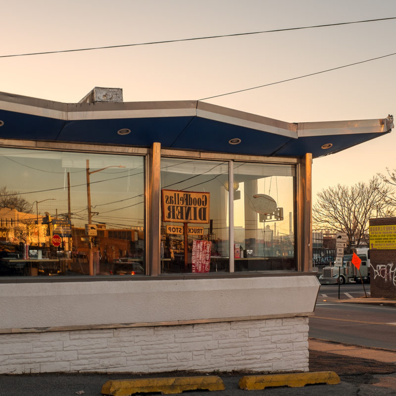
LF: Yes, of 63 images in the book, 32 are of Pennsylvania. I moved there, from Brooklyn, in 2018. One reason I was first drawn to PA is because it appears in Stephen Shore’s Uncommon Places. Specifically, I took a bus to Easton — the closest spot to NYC in the book — to visit the site of the image “Church Street & Second Street, Easton, Pennsylvania.” (And now I live in Easton!) These days I both photograph while I travel and travel to photograph but I would say it’s 85% trips that are based around photography. For instance, pretty much every year for my birthday I ask my husband to take me somewhere I want to photograph. This year I have a list of 18 diners around Eastern PA that I hope to hit over four days. I sent the map to my husband yesterday and got back the response, “I will gain 10 pounds from this! I can’t do all of these.” Lol. It’s an occupational hazard.
MK: The human touch is so present in each of your photographs. Even those without human subjects seem to be about people. What do these sorts of unpeopled frames need to work as photographs in your view?
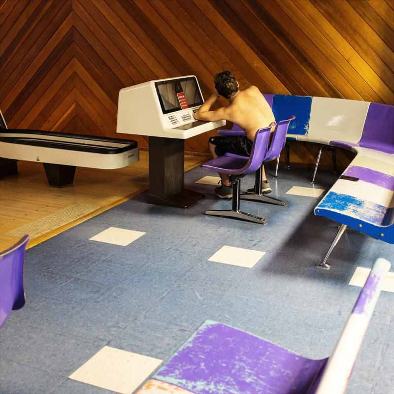
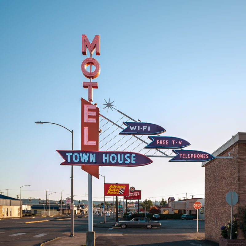
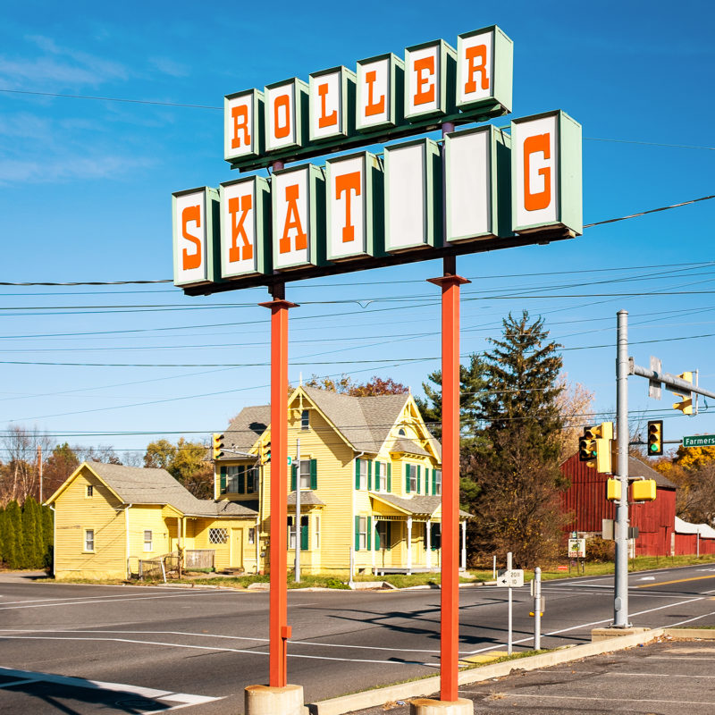
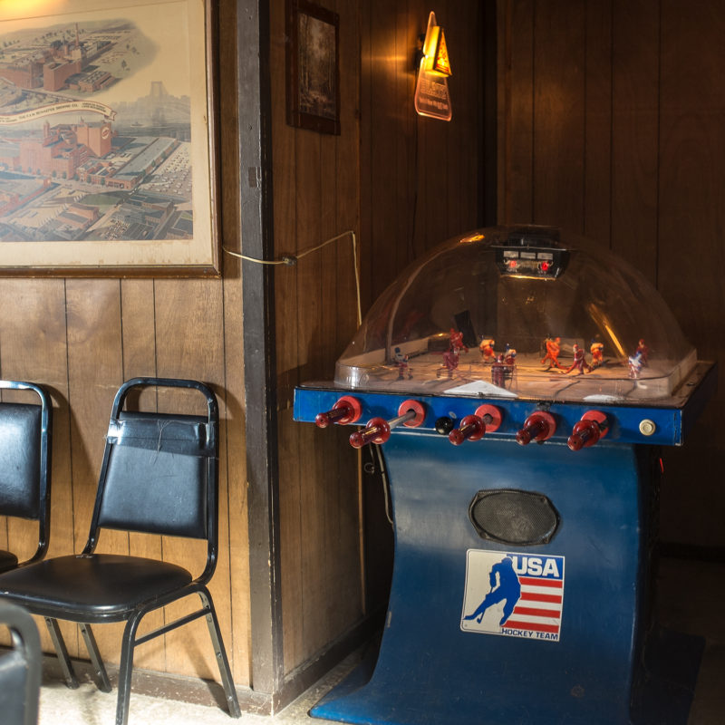
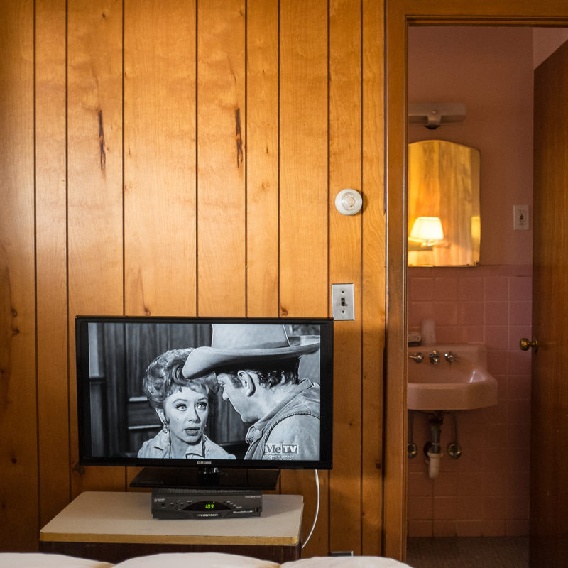
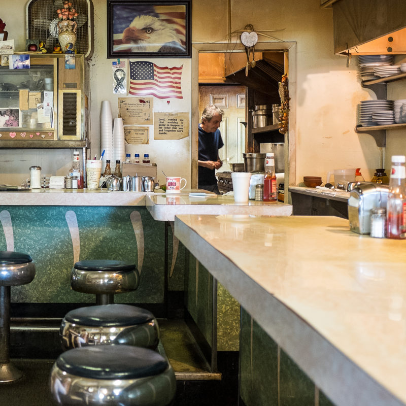
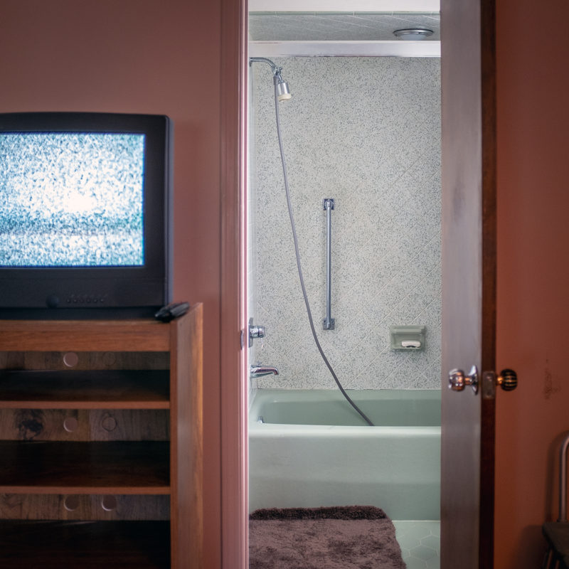
LF: I absolutely love interior spaces. I feel they are dripping with the stories of the people who have been there before. I’m drawn to small things, often on the side of the frame: mugs with sayings on them, notes or photos on walls, the marks on diner counters from years of elbows, the scuffs from 100s of feet under barbershop chairs… I personally love an unpeopled frame that is composed of many layers, that has multiple things to discover the longer you look at it. In my view the photo needs a certain strong composition to hang together, this might make it appear deceptively simple. And then, within that, you need to be able to feel the eye of the photographer, where they were standing and what they may have been feeling. Then there are the small details that unfold as you spend time with the image. And finally, but maybe most important of all, is the light. I’m not saying I achieve this all the time, but the photographs that are most special to me, that really hit me, have a remarkable quality of light and color.
MK: I have to address the square because I love the 1:1 aspect ratio. Why the square?
LF: I took a photography class in high school, my first exposure to it really, and I was given the chance to use a medium format Yashica TLR, which produces a 6×6 image. I found that I enjoyed composing that way. When I picked up photography again as an adult, I bought a digital camera that had the choice to compose in the 1:1 aspect ration and, because of my early use of it, I gravitated toward that setting. I composed square images in-camera. (It had nothing to do with Instagram!) When I switched back to film I bought a Rolleiflex and again, it produces a square image. When I DID start an account on Instagram this proved quite handy! I also couldn’t believe the name “American Squares” wasn’t taken. It seemed like an obvious choice.
MK: My read of the book was from the point of view of a lonesome drifter, passing from town to town. This might be more indicative of my own cynical view but I sense a lonesomeness in the selection. You depict communal spaces (bars and diners) but they are mostly empty. And then the motels, cars, and homes convey a sense of solitude. A Walt Whitman quote is also included that, through this lens, gave me a sort of melancholic feeling of nostalgia: “The past, the future, dwelling there, like space, inseparable together.” These places, stuck in time, certainly have their charm but is nostalgia just a lonely drifter?
LF: Interesting… I think there is a saying, something like “Every photograph is a form of self-portrait (?)”. I have always been a fairly solitary person and that is probably reflected in the work I produce and in the spaces I am drawn toward. I find them peaceful. I sometimes view my work as somewhat selfish, there is a sense of calm to be had in making these images and in the act of traveling for the photograph and then composing it through the glowing glass square. Also, I was investigating an idea of America that is based in the past. It’s not actually a place we can return to. It’s not a peopled space. The artifacts remain but the people have kept moving forward.
MK: You’ve been active on Instagram for a while. Scrolling through the insta-grid and flipping through a book are similarly interactive and individual experiences of photography, but they are obviously also very different. As a book artist as well as an Instagram artist (and this is touched upon briefly in Yani’s forward) do you have a preferred exhibition format? Did you find the manner in which the viewer interacts with your photos a different consideration as opposed to posting on Instagram?
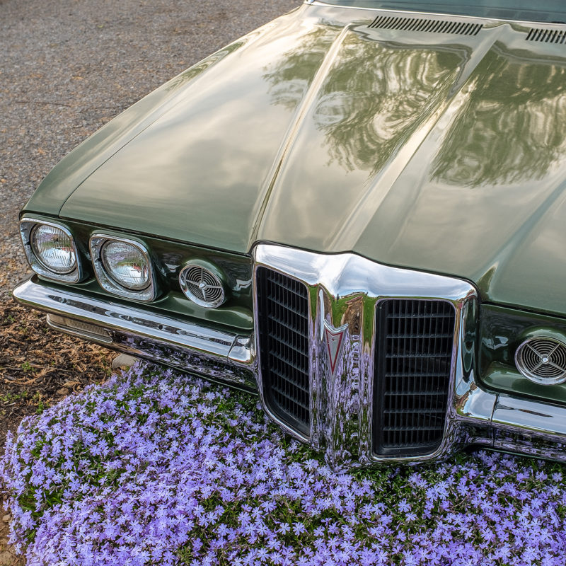
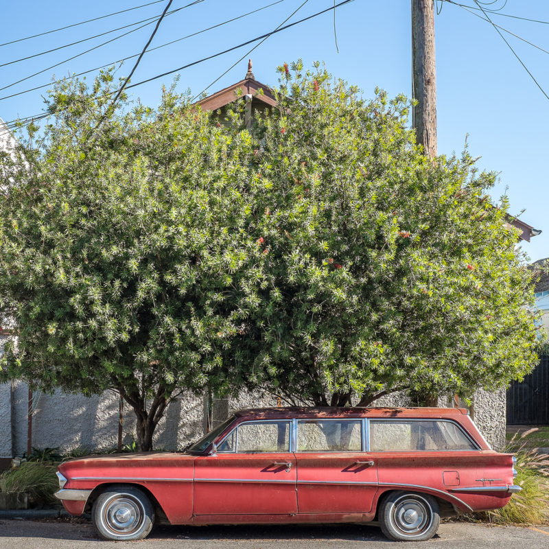
LF: I have always approached Instagram, since my first posts, with a sense of sequencing. I don’t know if anyone has noticed, but I post three images at a time, and they are almost always an interior, an exterior, and a car. I plan these posts out sometimes a month or two ahead and I try very hard not to have, when you look at the grid, any car on top of another, or interior over an interior, etc. In that way, my Instagram may be a little like a book, because I do plan it and think about how it works together as a unit. But I cannot MAKE people notice! I loved working on the book because I got to, again, control the sequencing but this time I knew there was no escape! Haha! I mean, if you start at the front and turn the pages you are going to see what I want you to see in the order I have planned. I did think a lot about it. With Instagram, I never know if people are just hopping in and seeing one photo, apart from the others, or if they are going to my profile page and seeing that the grid works quite peacefully, almost as a gallery wall (I hope.) I’ve always wanted to print out my Instagram feed and put it in a space. For a very long time Instagram was my only way to reach people with my work, it really was functioning as a little exhibition.
MK: What was your experience of sequencing the book? Was getting photographs off the phone and into a book always the goal?
LF: I started thinking in terms of a book quite early and have made a few zines over time on Blurb, MagCloud, Artifact Uprising, etc. I love sequencing, it became another way to enjoy the experience of making images. When it came to actually making the book American Squares though, I’m not going to lie, it was painful! I probably have 40,000 images spread across five different hard drives. Editing it was very difficult but luckily I had a few other sets of eyes go over my choices. One thing I discovered, and maybe everyone knows this, but I previously didn’t, is that you might end up leaving behind some favorite single images in putting together the unit of the book. Things have to flow together and sometimes what could be a strong image just doesn’t fit with the others in a way that works. There are many of my personal favorite images that are not in this publication. But overall, I feel good about the way it turned out.

MK: Did you work with a designer? How was the design conceived?
LF: No, I designed the book myself. It was scary! I have worked in the publishing industry for a long time alongside many extremely talented designers and I laugh now, but it was a huge fear that some of them might see my book! I had that in the back of my mind the whole time I was working on it. Financially, a designer didn’t feel like an option but I had an idea of what I wanted and I hoped that I could do it. Coming up with a cover idea was a challenge but finally, I looked at what was actually a vintage sign that I have hanging in my kitchen (bought off a porch somewhere while driving in Pennsylvania) and I decided to photograph it on wood paneling. I scoured the area for the RIGHT wood paneling and finally traveled 8 hours by bus, subway and then two trains to get to it (!) but it all worked out in the end.
MK: Music seems to play a large roll in your process. American Squares opens and closes with images of jukeboxes. I also noticed that on your website, you have a song streaming for each series. Do you find inspiration in music? Do you make playlists for the road? Who are some artists we might find on your playlist?
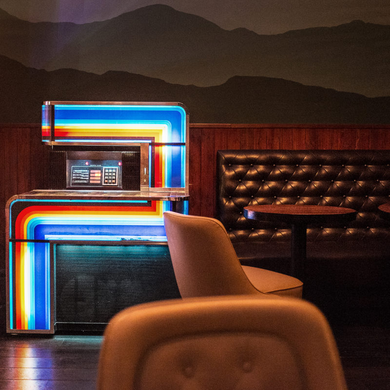
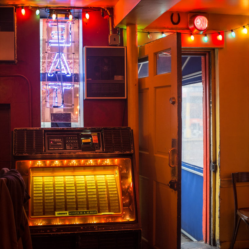
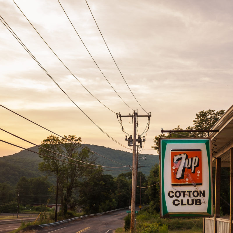
LF: My husband is a musician so I can thank him for exposing me to his deep knowledge of music. Wherever we drive, music is always playing. Now, we have Sirius Satellite Radio but in the past, it has been an iPod, CD playlists, even cassette tapes. There has always been music and often a song will be playing, one that I don’t even know but have fallen in love with at the moment, and then we will happen upon some magic light or scene and the two will fuse in my mind. One of the songs we got married to stuck in my heart because it was playing at the same time I saw a beautiful old neon sign reflected in a rain puddle (the song was “Oh How Happy” by The Shades of Blue.) Honestly, I have an odd relationship with music. I LOVE it, particularly jazz, but I cannot remember it—lyrics, song names, artists… It resonates on an emotional level but not an intellectual one, if that makes sense. Again, my husband has an encyclopedic knowledge of it and a large record collection. He DJs regularly. So, any playlist I might tell you right now would all be him! I will say though that I start each weekday morning with Bird Flight – the music of Charlie Parker via WKCR at 89.9 FM in the NYC area or streaming at WKCR.org. I highly recommend it! And jukeboxes, yes… not only do they play the songs that so frequently mingle in my mind with my images but I find them to be beautiful machines. I also used them along with other conceits, as a way of structuring the book.
MK: Are there any photobooks you’ve been looking at recently that have inspired you?
LF: Two photobooks I keep coming back to lately are Juke Joint, by Birney Imes and At Home, by Bruce Wrighton. I’ve been thinking a lot about interiors.
To view more of Leah Frances’s work please visit her website.